I decided to review the website of the Fayetteville Free Library, a really cool library that I toured this summer in my home state of New York. The library itself is very well-designed and innovative, and has one of the earliest maker spaces established in a U.S. library.

The Fayetteville Fab Lab
I loved my visit there and was curious to see how well their web design matched the library itself (surely it would be better than the dreadful website of my local library!)
What I found was mixed. It’s clear some good design thinking went into the website. Text is scaled down, the design is pretty clean with clearly defined areas, persistent navigation, and a focus on what library visitors are most likely to want to do or to find out. The portions of the site that are controlled by the library itself are pretty good. The really major problems I encountered were a common library problem mentioned in the lecture: the fact that libraries do not control the look and feel of catalog and other vendor-supplied systems (Schmidt lecture). The transition between the library website and the vendor-supplied catalog and event registration systems is awkward and painful. Unfortunately, as Aaron mentioned, there is not an easy solution for this problem.
The Good and the Pretty Good
Home Page
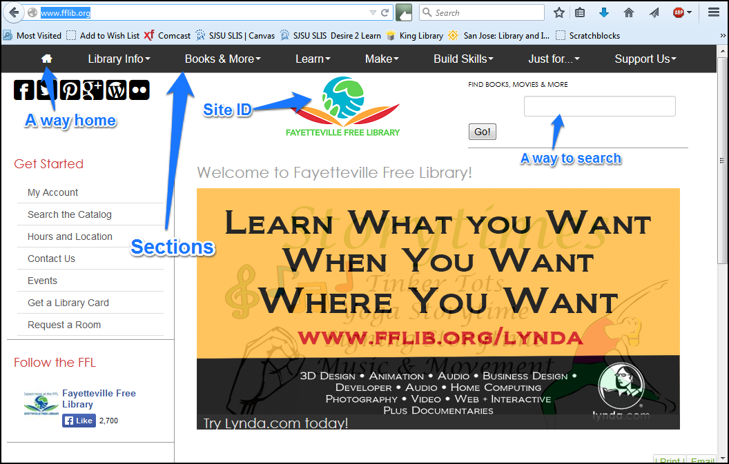
Home Page
The home page is aesthetically appealing. There is a minimum of text (Krug, 2006, ch. 5), and areas are clearly defined with plenty of white space (Krug, 2006, ch.3). The navigation has four of the five elements Krug recommends: site ID, a way home, a way to search, and clear sections. Utilities are not apparent but this may be because there are not clear “utilities” got a library as opposed to a commercial site (Krug, 2006, p. 62). The one “utility” might be the library user’s circulation account, but that function is handled by the vendor-supplied catalog (problems with that discussed below).
As mentioned in the lecture, library website visitors overwhelmingly want to find a book (Schmidt lecture). There is an obvious search box as well as a link on the left navigation menu to “Search the Catalog.” Other tasks or information that site visitors are likely to want are also clearly labeled (hours and location, get a library card, request a room), making popular choices fairly mindless (Krug, 2006, ch.4). Many “reasonable choices” are readily available (Krug, 2006, pp.24-25).
The home page accomplishes most of what Krug discusses in chapter 7: The identity and mission is clear, the sections demonstrate the site hierarchy, searching capability is obviously located, there are “teases” promoting interesting library events or services, and the page is updated frequently which may entice people to check frequently and see what’s new (Krug, 2006, ch.7).
A couple of things bothered me on the home page. This is not visible in the screen capture, but the central image on the page is a jQuery slideshow that promotes various library services and events. This can be done well, but this slideshow moves fast enough that I find it jarring and distracting. This, in my opinion, somewhat worsens the signal to noise ratio for the page (Schmidt lecture). It seems like a little too much “sizzle” (Krug, 2006, p. 163). The slideshow images are clickable and will take you to the page for the event or service mentioned, but they go by so quickly it is difficult to decide whether you want to click, so that I felt rushed. Having to use the arrows and click back to the image makes you work harder in order to access information you might want. This choice takes more work and doesn’t provide a “mindless” choice since the information has to be worked for (Krug, 2006, ch. 4). However, this may be just my opinion. I’m a bit biased against “animations.” Per Krug, it would probably be desirable to test user’s reactions to the slideshow to see how well it worked for a variety of people (Krug, 2006, ch. 8).
I also wondered about the choice to make the link to home the quaint little house icon. It is perfectly clear what it means but it looks a bit dated compared to the other worded links. Making a “Home” link to match the other sections would not detract from usability and would look more up to date and harmonious, in my opinion. It’s also an inconsistent choice considering that some usability was sacrificed in the case of breadcrumbs to achieve harmonious design (discussed below).
Persistent Navigation
The persistent navigation on the site (vendor systems excepted) was pretty good, with a few flaws. The sections, site ID and search box persist across the site pages. The basic layout and typography are also consistent (Krug, 2006, ch.6). I question the choice to “color code” the sections, however. When you navigate to different sections, the colors change to one solid color for pages in that section.

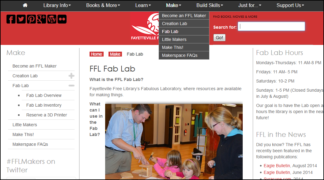
Color Changed Sections
This might be useful for “super users” who use the site so often that they come to recognize what the colors signify, but I think most users won’t really notice. The consistent navigation and typography prevents this from being really confusing, but I don’t think it is helpful and it isn’t really necessary. There is no obvious correlation between “Library Info” and the color blue, or “Books & More” and the color green, and so on. Users may wonder what the colors mean and have to think about it before they realize the pattern (Krug, 2006, ch. 1). It’s also not clear that there is any benefit to users to change the colors–they probably don’t really care what “section” they are in as long as they find what they want.
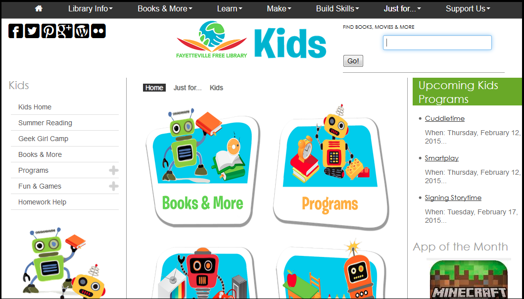
The section for kids is also altered. It reverts to the full color used on the home page. The site ID and typography are still recognizable but the site ID has the addition of “Kids” in large type. Since the overall design was already pretty clean and without extra text I am not sure this change is necessary.
Breadcrumbs
At first I thought there were no breadcrumbs, and then I realized that they were on the page, but the typography choices made me overlook them.

Breadcrumbs
The font seems to have been chosen to harmonize with the other type on the page, but there was no greater than/arrow symbol, which I was unconsciously looking for. That made it harder to recognize the breadcrumbs for what they were. While they do look in harmony with the other text, simply adding that simple arrow would make them easier to see. Once recognized however, they are helpful, and highlighting differentiates between the current page (which is not clickable) and previous pages, which are (Krug, 2006, ch. 6).
Browse New Items
I mentioned above that I found the slideshow on the home page a bit annoying. Interestingly enough there are more slideshows within the site (for kids, teens and adults) to allow users to browse through new items at the library. These slideshows, however, have a useful pause button so that you can look more closely at something before deciding if you want to click it.
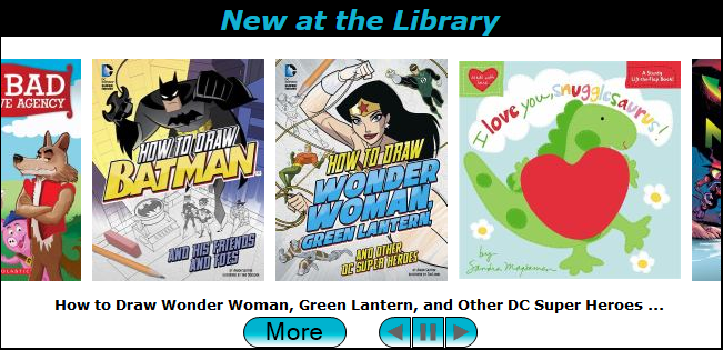
Browse New Items
This is a very helpful addition, Clicking an item will open the catalog page for that item, which is mostly good except for the part about having to use the catalog, which brings us to…..
The Bad
The major flaw in the site occurs when the user needs to click to the catalog or event registration systems. This is unfortunate since most users will probably want to use those systems, thus making the “main things” that users come to the library site for not “obvious and easy” (Krug, 2006, p. 163). Users will not understand (or care) that the catalog and event registration are not really under library control. However, as mentioned above, it is difficult to see how this could be easily fixed.
If a visitor wants to use the catalog, the clean design of the library site disappears and a more unfortunately typical catalog page appears:
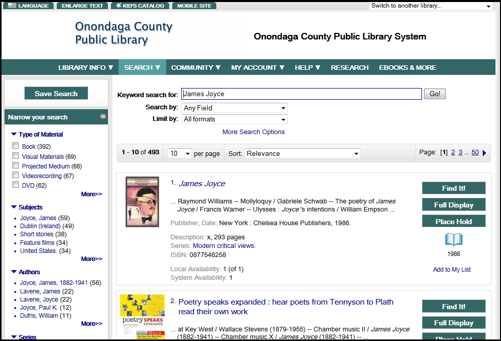
Catalog Page
This loses the sense of place that the library website maintained for the most part and is probably jarring to users. All of a sudden you appear to be in a completely different place (because you are, and yet it is necessary if you want to search for a book or log in and renew one). It provides an unfortunate feeling of having been shanghaied as in the “trunk test” (Krug, 2006, p. 85).
One small improvement that could be made is more consistency in what happens when links outside systems are clicked. At the moment, if you click a link that takes you to another system, sometimes it opens the system in a new tab, and sometimes in the current one. For example, on the home page, if you click “Search the Catalog” the catalog will open in a new tab, but if you enter a search in the search box the catalog opens in the current one. It may (right now anyway) be a necessary evil to have the ugly catalog system, but if it opened in a new tab site visitors might feel less lost since they could easily go back to the library website by clicking the site tab.
Clicking one of the events in the slide show opens the event registration system in the same tab.
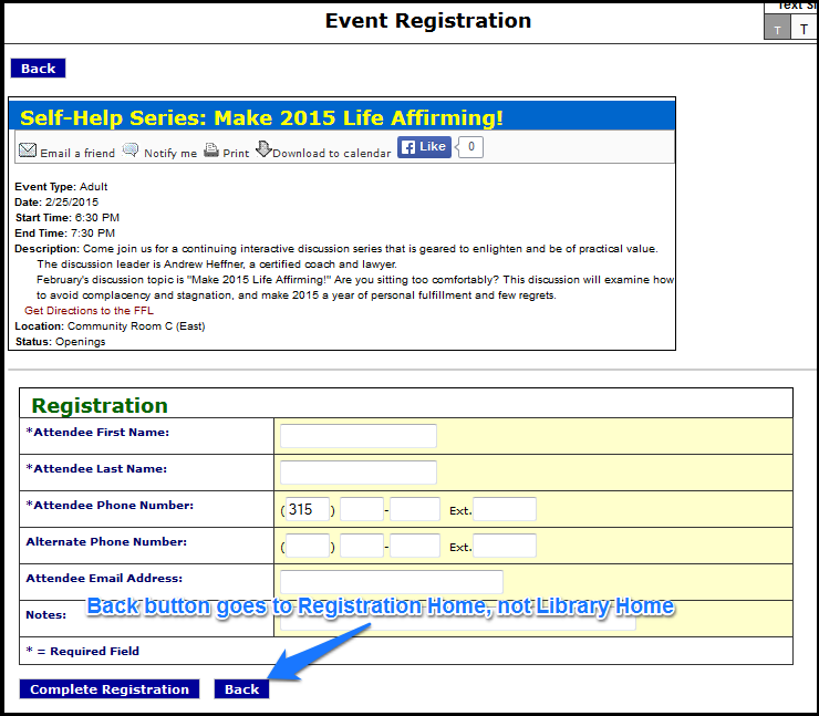
Event Registration Page
This page is particularly misleading since it has a “Back” button, but that button does not take you to the page you were just on at the library site, but to the home page of the library’s vendor-supplied event system. By the way, that page has a terrible signal to noise ratio:

Yikes!!
In Summary
The Fayetteville Free Library has clearly put a lot of effort into the aspects of its site that it can really control and also anticipated the kinds of information visitors are likely to want (Krug, 2006, p. 166-167). It’s discouraging that so much effort can be undercut by mediocre catalog design and I hope that in the future libraries will be able to organize and pressure more vendors to get their act together on user experience.
If you made it this far, you are awesome
REFERENCES
Krug, S. (2006). Don’t Make Me Think: A Common Sense Approach to Web Usability. Berkeley, CA: New Riders Publishing.
Schmidt, A. (2015?). Week Three: Intro to Library Website UX (video). Retrieved from http://libraryux.org/modules/week-three/

February 11th, 2015 at 8:25 pm
It feels that web sites have to evolve from simple sites to fully interactive applications. They offer pages where users can navigate and interact. All of this means that users and designers must collaborate and work together much more than they did previously. That said, designers should love to hear user opinions on the matter and hopefully designers can integrate ideas into the website to help it evolve into something more solid and useful
February 14th, 2015 at 1:34 pm
Thanks for your thoughts! 🙂 I agree, one of the issues that we see now is that what is expected of a library website has changed so much so rapidly, site builders must tack things on and sometimes you get a bit of a mess. And users are getting more demanding about design.
February 13th, 2015 at 10:22 am
I made it this far!
Fantastic analysis. And great job catching how they implemented breadcrumbs. Those definitely aren’t obvious, and do sort of add some visual clutter to the pages.
Really interesting choice on their part to put the site ID in the middle of the page. Unconventional. My eyes keep going to those (annoying – yes, I said it) social media icons.
February 14th, 2015 at 1:36 pm
Thanks! I found the central logo and the social media icons a bit annoying as well. I thought it was just more evidence that conventions are usually your friend, and you shouldn’t break them except for good reason. From a purely design point of view it’s not too bad but as far as usability goes there is that split second of looking in the wrong place first.
February 14th, 2015 at 9:37 pm
Molly, thanks for a detailed and engaging analysis. I also dislike the automatic carousel in the middle of the home page—too much movement taking up too much real estate. I understand the pain on non-matching OPAC UIs, but as you point out, this library I think has too many different styles for the various sections. It makes me wonder whether the library hired different web designers for the sections. (Who thought of black icons and text on a dark blue background? It’s nearly illegible.)
February 15th, 2015 at 12:47 pm
The Fayetteville Public Library gets around! Last semester, it was mentioned in HyperLinked Libraries for its makerspace! Agree with your comment about the issue of making catalog interfaces from outside vendors work well within a library’s web site. That was certainly something I saw when I analyzed the Virginia Beach Public Library’s site.
February 15th, 2015 at 4:53 pm
Hi Nancy, thanks! That is not a coincidence–I learned about the FFL when I took Hyperlinked in Spring 2014. It’s in my hometown neck of the woods, so when I visited this summer, I went to see it! Well worth it.
Molly