Monthly Archives: February 2015

Effective Web Content

New York Public Library Classes Page

NYPL Classes Page

NYPL Classes Page

I thought that the New York Public Library’s Classes page deals with the issue of library programs in a very large library system really well.

The overall site design and global navigation is well done. There is a lot of space, scannable text, and sensible persistent navigation. A brief line of text at the top of the page makes the important point: there are a lot of library classes and they are free! The essential message is presented and people can look for more detail further down, following the inverted pyramid style (Redish, 2007, p. 102-106).

This page uses a table and a filtering form well to deal with a very large amount of content.  It’s logical to group all the classes together, but there are 1,934 of them (at press time)! How can anyone handle that amount of data? Well, they can handle it if the path is smooth (Redish, 2007, p.63).

The classes pages opens with the classes displayed in a nice table below the fold. Probably very few people want to scroll through all the classes NYPL offers but they no doubt come in looking to narrow it down in varying ways. The filtering form is a great tool for doing this–people can look for classes in their local branch, or classes on a specific day, or all classes for seniors (or by keyword also). Once people have narrowed things down by the criteria that are most important to them, they can scroll their results.

The table displaying the results is well done. It uses shading, light lines and sufficient space to make the text easy to scan without drawing attention to the table itself (Redish, 2007, pp. 231-232). A really nice touch is that the “context-giving column headings” (Redish, 2007, p. 231) are implemented to float and remain visible at the top of the screen as the user scrolls the content of the table.I found this page to be a highly effective presentation of a potentially overwhelming amount of information.

North Carolina State University Print Copy Scan Page

NCSU Print Page

NCSU Print Copy Scan Page

The North Carolina State University Libraries Print, Copy, Scan page is a good example of a page where information is layered to make a large amount of information into a manageable amount (Redish, 2007, p. 114).

As with the NYPL, the site design and global navigation is clean and scannable. On this page, Note the emergency notice (on the page at screen capture time though not when I first looked at the page and chose it!) giving users important information about alterations in the library schedule due to the sever weather conditions. This type of emergency banner is very useful for pages that users may bookmark or arrive at via a Google search. The banner prevents users becoming frustrated because they did not get notice about an unexpected schedule change.

Printing, copying and scanning is logically grouped together, but these topics (especially for a large library system) cover more information than can realistically be presented on one page and keep the page easy to read. Basic information about each function is presented, and clearly formatted links lead to pages with additional information. A clear path is presented depending on what type of information the user is seeking (Redish, 2007, p. 63). Sentences are clear and the second person (“your AllCampus account” and “You can purchase a WolfCopy card”) is used (Redish, 2007, p. 181). Although some weak verbs and passive voice are  used, it seems appropriate: “Flatbed scanners can be borrowed” and “Zeutchschel Book Scanners are located” seem like a more appropriate way to write those sentences, since the interest is in what the library has. Numerous sentences saying “You can borrow A, You can borrow B” would be more difficult to scan.

This is a page for very functional information: “happy talk” is eliminated and users can quickly find the basic information they need or find the pathway to it.

REFERENCE

Redish, J. (2007) Letting Go of the Words: Writing Web Content That Works. San Francisco: Elsevier.


Advertisement

Rewriting Web Content

Alameda County Library, Apply for a Library Card

aclibrarycard

Alameda County Library Library Card Page

This Alameda County Library Library Card page is busy and confusing. There is way too much information on most pages, and information is duplicated on some pages (for example, there are  two pages about getting a library card that present the information differently, Example A and Example B). There needs to be more layering of information so that all the possible choices are not presented up front. For my first rewrite I chose Example A of the “Library Card” pages.

On the main page, there is a “How Do I” link with many choices. This is visitor-focused but it goes downhill from there. The main page link is “How do I apply for a library card?” On the page this links to, the heading says “There are two ways to register for a library card.” The first of these two methods (the ecard) is described, and then further down the page a heading says “How to Get a Card.” More attention should be paid to keeping the terminology parallel (probably the simplest term, “get” is the best choice).

This page is really busy, with two layers of tabs and three columns with boxes of varying sizes. The three columns and multiple boxes might be understandable if most of the content was global navigation, but clicking through the different tabs shows that it is not. There is much too much material on one page. Some of it needs to be booted off the page–particularly the redundant “Get Carded” right column box about getting a library card when you are actually on the library page!

The likelihood is that most visitors to this page will not want most of the options presented in navigation. People interested in “library account” or “library card” are probably focused on getting a card, reporting or replacing a lost one, viewing and/or paying fines, seeing what they have checked out and when it is due, and holds and renewals. Almost everything else is more detailed information that might be more appropriately layered in.

The central column contains the primary content for the page. The headings are confusing. I tried outlining them as they probably appear to the user, though not all the enlarged “heading like” text is actually tagged as a heading with HTML. Non-parallel structure made this difficult but here is one interpretation of the “headings””

contentoutline

Library Cards Page Content Outline

What? That “There are two ways to register for a library card” looks misplaced and confuses the hierarchy of headings. Information on who can get a card is not in the same place in the two different procedures (and it should probably be up front since it is important to know before you try applying).

The online application procedure doesn’t tell people up front that only people 14 and over can use that method. Site visitors will only find that out after clicking through to try and fill out the form, so that if they are trying to get a card for a child, they will have to use the dreaded Back button (and there is no link on the form page to return to the previous one).

The information that you will receive an email “if an email address submitted” is odd, since the subsequent form requires an email address (and would anyone without an email address even be likely to register for access to electronic resources?).

I rewrote it by eliminating a lot of the navigation choices, presuming more layering of information to reach less often used choices. I changed the paragraph instructions to simple brief lines of instruction and bulleted lists that are easier to scan. I eliminated a lot of information that will be repeated on the registration form and that does not make sense to repeat up front–most people know how forms work.

ACL1rewrite

Rewrite of Alameda County Library Cards Page

 Alameda County Library, Loan Periods and Checkout Limits

aclibrarylimitsfees

Alameda County Library Loan Periods and Checkout Limits Page

The Alameda County Library Loan Periods and Checkout Limits Page is brief and informative, but the clunky formatting makes the information harder to scan than it needs to be. Fonts and formatting are different with no apparent reason for the difference.

The text is presented with no embellishment. This is generally a good thing but the page fails to welcome visitors. Switching to a friendlier second person style (“you can check out…”) will not add many words and will make the page seem more welcoming. It is also odd that library patrons/members/site visitors are referred to as “customers.” Also, librarians may think in terms of “print materials” but site visitors are probably thinking about “books” and “magazines.”

I added question headings and second person address to help the site visitor find the information easily and identify with it. I also created a table to make the loan periods for different types of library materials easier to scan.

ACL2rewrite

Rewrite of Alameda County Library Loan Periods/Limits

Fayetteville Free Library, Apply for a Library Card

Fayetteville Free Library Get a Library Card Page

Fayetteville Free Library Get a Library Card Page

This  Alameda County Library’s confusing library card page made me curious about how the Fayetteville Free Library might present the same information. In our week 3 assignment I found the FFLIB site was pretty good and had real attention to design, so I decided to compare the FFL library card page.

This was a very interesting comparison. The Fayetteville Free Library did a fantastic job of cutting words on this page. They have lots of space. They use second person language and text is brief so that information is easy to grab. But I found some flaws here.

First of all, they have cut so many words that some questions are not answered: am I eligible to apply for a library card? Do I need to be a resident of Fayetteville? Of Onondoga County? Of New York? I searched around for quite awhile to try and find this information and was unable to do so, even on other pages in the site or on the Onondoga County Public Library system site. My next question is, what counts as “valid photo ID and proof of address”? That information I was able to locate on the OCPL page about getting a card.

At the very least there should be a link on this page to eligibility requirements, but since the page is already so succinct I think adding it right on the page would not overburden the page with  information.

Another small flaw on this page is the numbered list. Items 1 and 2 are not steps, but two alternatives for applying for a library card. Since there are only two items it is not that confusing but ideally it should be a bulleted list rather than a numbered one (especially if more information is added to the page).

My rewrite changes the numbered list to a bulleted one, and adds information I think the page should have. Information about types of ID was available on the OCPL site, but I had to make up the information about eligibility since I couldn’t find any. I presumed a policy similar to the Alameda County Library system policy.

FFLIBrewrite     Rewrite of Fayetteville Free Library Get a Library Card Page

Rewrite of Fayetteville Free Library Get a Library Card Page


Usability Testing: International Children’s Digital Library

I was interested in testing a site designed specifically for children. The International Children’s Digital Library is an online library that lets children or parents/teachers browse for children’s books in many languages and read them online.

I tested with two child testers and one adult/parent tester. My script follows. I found that as I went through it I had to simplify it even more than I already had because the children were confused by some of the language (for example, “what strikes you” or “your impressions”). Parentheses in the script indicate changes or explanations I made when the children appeared confused.

Usability test script

(adapted from Krug, 2006)

Hello! Thank you for participating in this library site test!

Today I will be asking you to try using a website so we can see whether it works as intended (whether it works well, how easy it is to use). We will be looking at the website for the International Children’s Digital Library. I will ask for your impressions (ask what you think) of the home page of the website, then I will ask you to do a couple of things: I will ask you to browse for a book you might want to read, and then I will ask you to find out how to register for an account on the website (you won’t actually register, I will just be asking you to figure how you could if you wanted to).

The first thing I want to make clear is that we’re testing the site, not you. You can’t do anything wrong here. In fact, this is probably the one place today where you don’t have to worry about making mistakes.

As you use the site, I’m going to ask you as much as possible to try to think out loud: to say what you’re looking at, what you’re trying to do (what you want to click), and what you’re thinking about the site. This will be a big help to me. Also, please don’t worry that you’re going to hurt my feelings. We’re doing this to improve the site, so we need to hear your honest reactions.

If you have any questions as we go along, just ask them. I may not be able to answer them right away, since we’re interested in how people do when they don’t have someone sitting next to them to help. But if you still have any questions when we’re done I’ll try to answer them then. And if you need to take a break at any point, just let me know.

Do you have any questions so far?

  1. Before we look at the site, I’d like to ask you just a few quick questions.
  • How would you describe your computer and Internet knowledge—how familiar are you with using the computer and web browsing? (NOTE: I had to explain to the children that “web browsing” was “clicking around and looking around at stuff on web sites.”)
  • What kinds of sites are you looking at when you browse the Web?
  • Do you have any favorite Web sites?OK, great. We’re done with the questions, and we can start looking at things.

Test Script

Scenario #1: ICDL Home Page

  1. (starting from Google) Let’s go to the ICDL home page, www.childrenslibrary.org
  2. First, I’m going to ask you to look at this page and tell me what you think about it: what strikes you about it, whose site you think it is, what you can do here, and what it’s for. Just look around and tell me what you think.

You can scroll if you want to, but please don’t click on anything yet.

Allow this to continue for three or four minutes, at most. If the user does not answer these questions spontaneously, ask:
  • What is this site for? What can you do here?
  • Does the site look fun? Do you think you would like to use it?
  • What do you think about how the site looks? (Additional prompts if needed: Do you like the colors? What do you think about the number of links?)

    Scenario #2: Finding a Book to Read

Thanks. Now I’m going to ask you to try doing a couple of specific tasks. And again, as much as possible, it will help us if you can try to think out loud as you go along.

  1. What I’d like you to do now is look for a book that you might want to read (for adult tester: a book you think your child would want to read). How do you think you might do that? OK, let’s try that. [Wait a few minutes, help where needed]
  2. [After book record is chosen] Now I’d like you to try and open this book so you can read it. [Wait]
  3. [After books is successfully opened, or if 10 minutes pass without success] Great! Thanks. [If applicable, say: ] We can come back and read this book later, I promise.
  4. What did you think of this site? Was it easy to find a book to read?

Thanks, that was very helpful.

Scenario #3: Figuring Out How to Register

Thanks. OK, now I am going to ask you to figure how you can register as a library member at this site. You won’t actually be registering, we just want to figure out how to do that.

  1. We’ll start this task from the library’s home page. Do you know how to get back there? [Help if needed]
  2. How do you think you would register if you wanted to be a member of this site? OK, let’s try that.
  3. [After appropriate registration form (child or adult) is successfully opened, or if 10 minutes pass without success] Thanks! [If applicable say:] Let’s look at this registration form. Do you think it looks easy or hard to fill out? Do you have any thoughts about it?
  4. How would you go back to the library’s home page?

OK, that was the last task!

Do you have any questions for me, now that we’re done?

Thank you so much for participating in the site test! I really appreciate it!

Tester Profiles

Tester 1

Nine year old tester who uses the computer 1 or 2 hours a day. Primary occupation: fourth grade. Tester 1 said “I don’t do that [i.e. computer use and web browsing] a lot. Tester 1 said http://www.coolmath-games.com was his favorite website.

Tester 2

Eleven year old tester who uses the computer 1 or 2 hours a day. Primary occupation: sixth grade. Tester 2 said he was “pretty unfamiliar” with computer use and web browsing. Tester 2 said he did not have any favorite websites.

Tester 3

Adult tester who uses the computer 6-8 hours per day (uses computer for work). Primary occupation: telecom engineer/administrator. Also a parent. Tester 3 said he was highly familiar with using the computer and web browsing. Tester 3 said he had several favorite networking/technical sites, and also really liked ESPN, and IMDB.

Test Results

One of the things I concluded from this test is that it is probably really hard to design a website that will be used by both kids and adults. My child testers found the site pretty easy to use for the most part and completed tasks quickly. They were comfortable just clicking around and trying things.

My one adult tester, on the other hand, got very frustrated with the site functionality. This was contrary to my expectations. I chose a children’s library site to test because I was curious about design for children, since it seemed like children, who have less experience and fewer expectations of site conventions, might be harder to design an intuitive site for.

This site’s primary audience is children. It makes sense that they would design a site that kids will enjoy and find easy and fun to use. Based on two kid tests, it seems like they did that, but at the price of making it a somewhat annoying site for adults to use. The child testers were more willing to browse, whereas the adult tester was very focused on finding the most efficient path quickly. In this case, having experience and expectations about how sites behave worked against him. He said several times “Well this isn’t what I expected to happen.” The children never said anything like this.

For this site, it seems like many conventions were not followed, and this was not a problem for the child testers, since they had few expectations. The adult tester, however, struggled with the unusual choices.

Obviously I didn’t test enough users to make generalizations about how children vs. adults use the web, but the results did make me wonder if children in general are more willing to explore, less impatient, and more likely to be “link dominant” versus “search dominant.” My adult tester clearly wanted an efficient search strategy and found the site defective because there wasn’t one. Both child testers seemed more willing to just look around at what was there and browse rather than trying to immediately identify the most efficient search strategy.

Task Completion

All of the users completed all of the tasks, which I tried to make pretty simple since I was testing children. The overall completion rate was 100 percent. However, my adult user went down many wrong paths and became frustrated. A less persistent user might well have quit and gone to another site, especially if he really was a parent looking for a book for his child. Lots of children’s ebooks are pretty cheap on Amazon and are super easy to search and find!

Suggestions

Home Page

I’m wary of making suggestions since this seems like a situation where it’s going to be “fix one thing, break another.” The site worked pretty well for the children, and was pretty irritating to the adult. There are some changes I would make, however.

icdlhomepage

ICDL Home Page

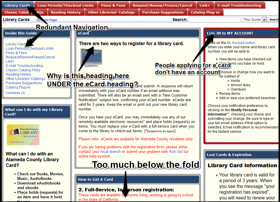
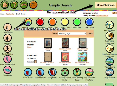
I would add a Search box on the home page. The adult tester commented unfavorably on the absence of a search box at the top of the home page, where he expected to see it. The large and centrally located “Read Books” icon is intended to take its place, making the page cater to link dominant users and ignore search dominant users. This didn’t seem to be a problem for the kids but the adult tester really wanted a search box. Adding in a search box would not overburden the home page, especially if my second suggestion were followed, which is to drastically reduce the number of choices on the home page.

There is just way too much on the home page. Tester 2 and Tester 3 both commented on how busy the home page was. Tester 2 commented that it was hard to choose because there “so many icons.”

Many of the options are redundant. For example, you can reach a search page by clicking the large Read Books icon in the center of the page, from the top menu under “Read Books” and also under “Help,” and on the left nav menu from no less than three of the links there! Certainly some redundancy can be desirable, to accommodate different ways people prefer to look for things, but this seems beyond what is necessary. A great deal of cleaning up could be done by eliminating redundancies.

I’m wondering about indicating some sort of prominent choice between “Search or Click Here to Browse Books” but that’s where I feel I might fix it for the adults and break it for the kids. This site is for children and “browsing” is not a term that registered with the child testers. The term “Read Books” obviously worked well for them, and I would hesitate to change that.

All testers completely ignored the large amount of “library news and notes,” mission statement, information about the “Foundation” and so on. Clearly, the home page is being used partly to market the library and solicit support as well as to be a functional library page–the result is way too much going on. A lot of “happy talk” promoting the library could be moved to a secondary page that is reached from a basic link on the home page such as “Support Us!” or “Learn About Our Mission!” or something like that. Designers might be concerned that people won’t donate or support if they don’t see it on the home page, but the testing showed that site visitors didn’t see it anyway–there is just too much stuff there.

My guess is almost all site visitors will arrive at the home page wanting to browse/search for books and read them, or to sign up or sign in to save books to their shelf. Given those likely priorities a much simpler home page interface is called for.

Simple Search

simplesearch

Simple Search Page

I found the Simple search page very interesting since it introduces access points that don’t make a whole lot of sense to adults, but really are ways that children think about books. One of the more interesting design choices was the ability to search by color. I’ve worked in K-6 and 6-8 school libraries, and kids ask all the time for “the blue book with the owl on the cover” or something like that. This site actually lets you search by the color of the cover and then shows an image of the book cover, so you really could search for a “blue book with an owl on it.” Tester 1 really approved of this feature because (the adage notwithstanding) “a cover tells you a lot about a book.” On the other hand, Tester 3, an adult and non-librarian, thought searching by the the color of a book was ridiculous.

Tester 1 clicked the main “Read Books” icon on the main page and found the SImple Search page immediately and liked it. Tester 2 chose various searches from the top menu on the home page, first choosing Recently Added Books, going back and choosing Award Winning Books, clicking Back again and choosing Full Book list (all from the top menu). Then he started scrolling through the long list of choices and selected a book. Although these strategies were different, they were both accomplished very quickly, and with no sign of frustration.

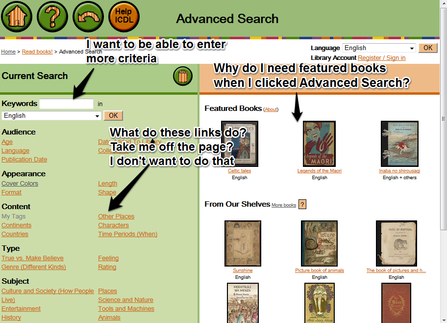
Tester 3 on the other hand, spent a long time looking for “Search” on the home page. First he tried the top menu Read Books > Keyword Search option and came up with too many book choices. Then he tried Read Books Advanced Search and was baffled by the Advanced Search page.

Advanced Search

advancedsearch

Advanced Search Page

The advanced search page lets you enter keywords and then…do what? Tester 3 didn’t want to click on the links because he expected them to take him off of this page. Actually when clicked the links open up and let you check boxes to filter for various criteria, but this is not apparent before you click them. Tester 3 was expecting a typical text entry advanced search where you enter something like subject: art, language: Italian and so on. This page was baffling and he retreated back to try the Simple Search page. He eventually found a book using the Simple Search page but it took him much longer and he experienced far more frustration than the child testers. I would recommend altering the page labeled Advanced Search to be a more conventional text entry type search, or at least call the page something else so that experienced computer users don’t get tripped up by their expectations of what an “Advanced Search” looks like!

Conclusion

Overall, this website works reasonably well for is target demographic (children) but could be improved by making it less busy. After reducing the visual clutter, a few accommodations for adults/experienced web users would be desirable. Search dominant users are disadvantaged on the home page and this should be fixed.

Testing Process

This was a really interesting process to go through. I really expected the tasks to be a breeze for my adult tester and more challenging for the child testers, but the opposite was true. On the other hand, the adult tester “thought out loud” with ease throughout the test and the children required a more concrete explanation of what that meant, and even after that I needed to prompt them as we went through the test.

Testing children requires even more simple and clear instructions. If I were testing children again I would make the language even simpler. It’s challenging because you don’t want to ask too many leading questions, but they seem to need more prompting. Abstract skills like “thinking out loud” and “giving your impressions” confused them a little. Now that I have tested children, I would spend more time simplifying the testing script and making statements very concrete (such as “tell me what you think you might click on”) and avoid the abstract statements “what strikes you?”) as much as possible.

After the fact I read a little bit about usability testing for children, and one reference mentioned that it is desirable to avoid the word “test” completely (Carraro, 2011). Adults don’t get tested a lot but school-aged children do. My child testers initially had a hard time accepting the fact that weren’t being tested even though I stated it at the beginning. I restated this a few times throughout the test.

The children seemed shy and quiet at the beginning of the test, probably nervous at this very unfamiliar activity. It is even more important to establish rapport with children since they are more likely to be shy with strangers or with unfamiliar conditions/activities (Hanna, Risden & Alexander, 1997). Even though these children know me well (since I am their mother!) it took them a long time to warm up. I would focus more time in the future on talking to the children on neutral kid-friendly topics to establish rapport (especially with children I did not know) and in chatting casually about what the test was for. By the end of the test both child testers warmed up and did a lot more “thinking out loud.” Hanna, Risen and Alexander mention the desirability of switching the order of tasks around so that time placement in the test does not affect the way children respond (Hanna, Risden & Alexander, 1997, p. 11). Their concern was children slowing down, balking, or beginning to act very silly at the end when they are tired (which might be an issue with younger children than I tested, or with longer testing sessions). By contrast, in my testing I found that at the end the children were most comfortable and volunteered the most extensive information, so it would be desirable to have different tasks placed at the end.

With regards to my adult tester, I found that not only are conventions your friend (Krug, 2006, p. 34), but altering them can cause significant annoyance to users who are familiar with them. This presents a problem for this kind of site, where you are trying to make something that appeals primarily to children but that adults can also use. It’s a significant challenge to make a site that works for two very different user groups.

REFERENCES

Carraro, J.M. (2011, July 21). Five things you should consider when testing with children [Web blog]. Retrieved from http://blog.usabilla.com/five-things-you-should-consider-when-testing-with-children/

Hanna, L., Risen, K. & Alexander, K. (1997). Guidelines for usability testing with children. Interactions, September/October 1997. Retrieved from http://www.microsoft.com/usability/UEPostings/p9-hanna.pdf

Krug, S. (2006). Don’t Make Me Think: A Common Sense Approach to Web Usability. Berkeley, CA: New Riders Publishing.


The Fayetteville Free Library

I decided to review the website of the Fayetteville Free Library, a really cool library that I toured this summer in my home state of New York. The library itself is very well-designed and innovative, and has one of the earliest maker spaces established in a U.S. library.

The Fayetteville Fab Lab

The Fayetteville Fab Lab

I loved my visit there and was curious to see how well their web design matched the library itself (surely it would be better than the dreadful website of my local library!)

What I found was mixed. It’s clear some good design thinking went into the website. Text is scaled down, the design is pretty clean with clearly defined areas, persistent navigation, and a focus on what library visitors are most likely to want to do or to find out. The portions of the site that are controlled by the library itself are pretty good. The really major problems I encountered were a common library problem mentioned in the lecture: the fact that libraries do not control the look and feel of catalog and other vendor-supplied systems (Schmidt lecture). The transition between the library website and the vendor-supplied catalog and event registration systems is awkward and painful. Unfortunately, as Aaron mentioned, there is not an easy solution for this problem.

The Good and the Pretty Good

Home Page

Home Page

Home Page

The home page is aesthetically appealing. There is a minimum of text (Krug, 2006, ch. 5), and areas are clearly defined with plenty of white space (Krug, 2006, ch.3). The navigation has four of the five elements Krug recommends: site ID, a way home, a way to search, and clear sections. Utilities are not apparent but this may be because there are not clear “utilities” got a library as opposed to a commercial site (Krug, 2006, p. 62). The one “utility” might be the library user’s circulation account, but that function is handled by the vendor-supplied catalog (problems with that discussed below).

As mentioned in the lecture, library website visitors overwhelmingly want to find a book (Schmidt lecture). There is an obvious search box as well as a link on the left navigation menu to “Search the Catalog.” Other tasks or information that site visitors are likely to want are also clearly labeled (hours and location, get a library card, request a room), making popular choices fairly mindless (Krug, 2006, ch.4). Many “reasonable choices” are readily available (Krug, 2006, pp.24-25).

The home page accomplishes most of what Krug discusses in chapter 7: The identity and mission is clear, the sections demonstrate the site hierarchy, searching capability is obviously located, there are “teases” promoting interesting library events or services, and the page is updated frequently which may entice people to check frequently and see what’s new (Krug, 2006, ch.7).

A couple of things bothered me on the home page. This is not visible in the screen capture, but the central image on the page is a jQuery slideshow that promotes various library services and events. This can be done well, but this slideshow moves fast enough that I find it jarring and distracting. This, in my opinion, somewhat worsens the signal to noise ratio for the page (Schmidt lecture). It seems like a little too much “sizzle” (Krug, 2006, p. 163). The slideshow images are clickable and will take you to the page for the event or service mentioned, but they go by so quickly it is difficult to decide whether you want to click, so that I felt rushed. Having to use the arrows and click back to the image makes you work harder in order to access information you might want. This choice takes more work and doesn’t provide a “mindless” choice since the information has to be worked for (Krug, 2006, ch. 4). However, this may be just my opinion. I’m a bit biased against “animations.” Per Krug, it would probably be desirable to test user’s reactions to the slideshow to see how well it worked for a variety of people (Krug, 2006, ch. 8).

I also wondered about the choice to make the link to home the quaint little house icon. It is perfectly clear what it means but it looks a bit dated compared to the other worded links. Making a “Home” link to match the other sections would not detract from usability and would look more up to date and harmonious, in my opinion. It’s also an inconsistent choice considering that some usability was sacrificed in the case of breadcrumbs to achieve harmonious design (discussed below).

Persistent Navigation

The persistent navigation on the site (vendor systems excepted) was pretty good, with a few flaws. The sections, site ID and search box persist across the site pages. The basic layout and typography are also consistent (Krug, 2006, ch.6). I question the choice to “color code” the sections, however. When you navigate to different sections, the colors change to one solid color for pages in that section.

Blue Color Coding

Red Color Coding

Color Changed Sections

This might be useful for “super users” who use the site so often that they come to recognize what the colors signify, but I think most users won’t really notice. The consistent navigation and typography prevents this from being really confusing, but I don’t think it is helpful and it isn’t really necessary. There is no obvious correlation between “Library Info” and the color blue, or “Books & More” and the color green, and so on. Users may wonder what the colors mean and have to think about it before they realize the pattern (Krug, 2006, ch. 1). It’s also not clear that there is any benefit to users to change the colors–they probably don’t really care what “section” they are in as long as they find what they want.

The section for kids is also altered. It reverts to the full color used on the home page. The site ID and typography are still recognizable but the site ID has the addition of “Kids” in large type. Since the overall design was already pretty clean and without extra text I am not sure this change is necessary.

fflibkids

Breadcrumbs

At first I thought there were no breadcrumbs, and then I realized that they were on the page, but the typography choices made me overlook them.

breadcrumbs

Breadcrumbs

The font seems to have been chosen to harmonize with the other type on the page, but there was no greater than/arrow symbol, which I was unconsciously looking for. That made it harder to recognize the breadcrumbs for what they were. While they do look in harmony with the other text, simply adding that simple arrow would make them easier to see. Once recognized however, they are helpful, and highlighting differentiates between the current page (which is not clickable) and previous pages, which are (Krug, 2006, ch. 6).

Browse New Items

I mentioned above that I found the slideshow on the home page a bit annoying. Interestingly enough there are more slideshows within the site (for kids, teens and adults) to allow users to browse through new items at the library. These slideshows, however, have a useful pause button so that you can look more closely at something before deciding if you want to click it.

Browse New Items

Browse New Items

This is a very helpful addition, Clicking an item will open the catalog page for that item, which is mostly good except for the part about having to use the catalog, which brings us to…..

The Bad

The major flaw in the site occurs when the user needs to click to the catalog or event registration systems. This is unfortunate since most users will probably want to use those systems, thus making the “main things” that users come to the library site for not “obvious and easy” (Krug, 2006, p. 163). Users will not understand (or care) that the catalog and event registration are not really under library control. However, as mentioned above, it is difficult to see how this could be easily fixed.

If a visitor wants to use the catalog, the clean design of the library site disappears and a more unfortunately typical catalog page appears:

Catalog Page

Catalog Page

This loses the sense of place that the library website maintained for the most part and is probably jarring to users. All of a sudden you appear to be in a completely different place (because you are, and yet it is necessary if you want to search for a book or log in and renew one). It provides an unfortunate feeling of having been shanghaied as in the “trunk test” (Krug, 2006, p. 85).

One small improvement that could be made is more consistency in what happens when links outside systems are clicked. At the moment, if you click a link that takes you to another system, sometimes it opens the system in a new tab, and sometimes in the current one. For example, on the home page, if you click “Search the Catalog” the catalog will open in a new tab, but if you enter a search in the search box the catalog opens in the current one. It may (right now anyway) be a necessary evil to have the ugly catalog system, but if it opened in a new tab site visitors might feel less lost since they could easily go back to the library website by clicking the site tab.

Clicking one of the events in the slide show opens the event registration system in the same tab.

Event Registration Page

Event Registration Page

This page is particularly misleading since it has a “Back” button, but that button does not take you to the page you were just on at the library site, but to the home page of the library’s vendor-supplied event system. By the way, that page has a terrible signal to noise ratio:

Hideous Events Home Page

Yikes!!

In Summary

The Fayetteville Free Library has clearly put a lot of effort into the aspects of its site that it can really control and also anticipated the kinds of information visitors are likely to want (Krug, 2006, p. 166-167). It’s discouraging that so much effort can be undercut by mediocre catalog design and I hope that in the future libraries will be able to organize and pressure more vendors to get their act together on user experience.

Fayetteville Free Library, interior picture

If you made it this far, you are awesome

REFERENCES

Krug, S. (2006). Don’t Make Me Think: A Common Sense Approach to Web Usability. Berkeley, CA: New Riders Publishing.

Schmidt, A. (2015?). Week Three: Intro to Library Website UX (video). Retrieved from http://libraryux.org/modules/week-three/


Subject to Change and Libraries

He who falls in love with himself will have no rivals.
~Benjamin Franklin

On January 29 I attended the annual joint meeting of Baynet and the San Francisco SLA chapter. The main speaker at this event was Sarah Houghton, who is the director of the San Rafael Public Library and maintains the Librarian in Black blog. The title of her talk was “The Wrong Love.” Her subject was a critique of the common “I Love Libraries” marketing messaging. She made the argument that this is completely turned around from what library messaging ought to be, that libraries instead should be promoting the message “Your Library Loves YOU.”

During the questions after the talk, a corporate librarian asked for Ms. Houghton’s take on how “your library loves you” could be applied to a corporate environment, since the culture in many special libraries is different from that of most public libraries. Ms. Houghton addressed this by saying that a more corporate spin on this message might be focusing on the library’s service orientation and letting patrons know what the library can do for them. Even in a more formal businesslike environment, one of her main points, “focus on the community, not on yourself,” still applies. I found both the talk and this question/answer very thought-provoking in terms of libraries demonstrating their value to their communities, and it was interesting going through the readings this week with this recent talk in mind.

In Subject to Change, Merholz et al discuss how one view of customers is simply as consumers, as a means to make a profit (Merholz et al, , 2008, p. 41). Libraries don’t see patrons as a source of profit, of course, but it struck me that the “I love libraries” message–urging patrons to give libraries their “love,” their support, their votes for bond measures!–is a kind of nonprofit version of viewing them as a source of profit. Rodger argues that libraries need the larger entities of which they are a part (whether those are a city, a university, or a business), and they need to give value back to their host systems (Rodger, 2007). This seems like another way of saying “your library loves you”–that is, a library needs to offer what is wanted by the members of the host system. It is certainly advantageous to do some marketing to convince the host system that the library is valuable and desirable, but focusing exclusively on how “lovable” libraries isn’t as useful towards this goal as showing people what desirable experiences the library has to offer. (“Think not what the patrons can do for you…)

As for other views: I don’t think libraries are particularly disposed to view patrons as sheep who are waiting to be told what to do. Tasks and goals orientations or rational actor views are probably more common, especially in academic or special libraries, where people usually are pursuing specific professional goals. This type of thinking is fairly useful, since we do need to allow patrons to accomplish goals, but without knowing more about people, its hard to anticipate tasks and goals that patrons would appreciate, but haven’t thought of yet. Public and school (K-12) libraries probably have the most focus on the human factor. Seeing patrons as whole people is necessary for being able to develop new desirable experiences. If we focus on tasks and goals–”that patron wants to check out children’s books”–we might simply have a checkout station. But if we realize, “that patron wants to enrich her children and also make her life easier by finding something to amuse them, even though it is a struggle to get out of the house with little kids”–we might put a bead roller coaster next to the checkout station so that she can take a few minutes to check out books without being distracted by fidgeting toddlers.

During her “Wrong Love” talk, Ms. Houghton pointed to the “I Love Libraries” website. She asked the audience, “and who does it sound like this website is for?” The answer was that it sounds like it is a site for library patrons, which she agreed to but then said, “But if you look at the website, it really looks like it is a site for librarians.” That is, it’s a site for librarians to cheerlead themselves. I was reminded of the Bain Company survey mentioned by Merholz et al where they found that while 80 percent of companies thought they offered a “superior experience” but only 8% of customers agreed (Merholz et al, 2008, p. 104). That is a pretty big disconnect between the service provider and the customer. Sadly the number didn’t really surprise me; I have worked in a lot of high tech firms, and the internal messaging, especially at company wide meetings, is often focused on how awesome the company is (or how “lovable”). Maybe it’s fine as a way to cheer ourselves on, but it is an error to mistake this pep rally type of talk for reality.

Research helps reduce this disconnect between how awesome we think we are (because of our good intentions), and how awesome the experiences we provide actually are.  We need research to see what is, not what we assume is true or think should be true. Quantitative research (like simple surveys or demographic analysis of a population) can provide a useful framework–the Bain Company survey is certainly a wakeup call, for example. Qualitative research methods, however,S get at a deeper understanding why things are happening (Merholz et al, 2008, p. 61).

Friends can help each other. A true friend is someone who lets you have total freedom to be yourself – and especially to feel. Or, not feel. Whatever you happen to be feeling at the moment is fine with them. That’s what real love amounts to – letting a person be what he really is.

~Jim Morrison

Design thinking and empathy can help libraries truly see people as they are, and “focus on people’s real lives” (Merholz et al, 2008, p. 100). Really seeing people will enable us to offer superior experience.

REFERENCES

Merholz, P., Schauer, B., Verba, D. & Wilkens, T. (2008). Subject to Change: Creating Great Products and Services for an Uncertain World. Sebastopol, CA: O’Reilly.

Rodger, E.J. (2007). What’s a library worth? American Libraries: September 2007, 59-60.