Alameda County Library, Apply for a Library Card
Alameda County Library Library Card Page
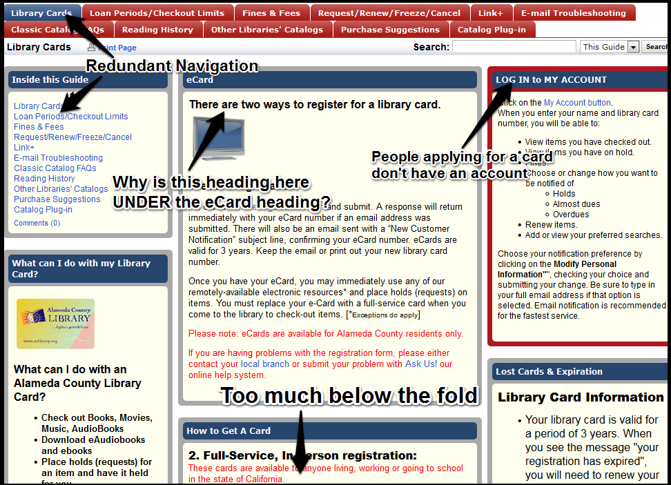
This Alameda County Library Library Card page is busy and confusing. There is way too much information on most pages, and information is duplicated on some pages (for example, there are two pages about getting a library card that present the information differently, Example A and Example B). There needs to be more layering of information so that all the possible choices are not presented up front. For my first rewrite I chose Example A of the “Library Card” pages.
On the main page, there is a “How Do I” link with many choices. This is visitor-focused but it goes downhill from there. The main page link is “How do I apply for a library card?” On the page this links to, the heading says “There are two ways to register for a library card.” The first of these two methods (the ecard) is described, and then further down the page a heading says “How to Get a Card.” More attention should be paid to keeping the terminology parallel (probably the simplest term, “get” is the best choice).
This page is really busy, with two layers of tabs and three columns with boxes of varying sizes. The three columns and multiple boxes might be understandable if most of the content was global navigation, but clicking through the different tabs shows that it is not. There is much too much material on one page. Some of it needs to be booted off the page–particularly the redundant “Get Carded” right column box about getting a library card when you are actually on the library page!
The likelihood is that most visitors to this page will not want most of the options presented in navigation. People interested in “library account” or “library card” are probably focused on getting a card, reporting or replacing a lost one, viewing and/or paying fines, seeing what they have checked out and when it is due, and holds and renewals. Almost everything else is more detailed information that might be more appropriately layered in.
The central column contains the primary content for the page. The headings are confusing. I tried outlining them as they probably appear to the user, though not all the enlarged “heading like” text is actually tagged as a heading with HTML. Non-parallel structure made this difficult but here is one interpretation of the “headings””

Library Cards Page Content Outline
What? That “There are two ways to register for a library card” looks misplaced and confuses the hierarchy of headings. Information on who can get a card is not in the same place in the two different procedures (and it should probably be up front since it is important to know before you try applying).
The online application procedure doesn’t tell people up front that only people 14 and over can use that method. Site visitors will only find that out after clicking through to try and fill out the form, so that if they are trying to get a card for a child, they will have to use the dreaded Back button (and there is no link on the form page to return to the previous one).
The information that you will receive an email “if an email address submitted” is odd, since the subsequent form requires an email address (and would anyone without an email address even be likely to register for access to electronic resources?).
I rewrote it by eliminating a lot of the navigation choices, presuming more layering of information to reach less often used choices. I changed the paragraph instructions to simple brief lines of instruction and bulleted lists that are easier to scan. I eliminated a lot of information that will be repeated on the registration form and that does not make sense to repeat up front–most people know how forms work.

Rewrite of Alameda County Library Cards Page
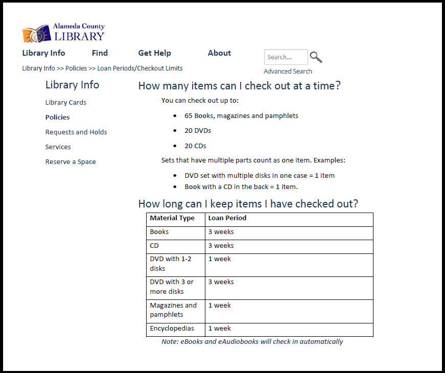
Alameda County Library, Loan Periods and Checkout Limits

Alameda County Library Loan Periods and Checkout Limits Page
The Alameda County Library Loan Periods and Checkout Limits Page is brief and informative, but the clunky formatting makes the information harder to scan than it needs to be. Fonts and formatting are different with no apparent reason for the difference.
The text is presented with no embellishment. This is generally a good thing but the page fails to welcome visitors. Switching to a friendlier second person style (“you can check out…”) will not add many words and will make the page seem more welcoming. It is also odd that library patrons/members/site visitors are referred to as “customers.” Also, librarians may think in terms of “print materials” but site visitors are probably thinking about “books” and “magazines.”
I added question headings and second person address to help the site visitor find the information easily and identify with it. I also created a table to make the loan periods for different types of library materials easier to scan.
Rewrite of Alameda County Library Loan Periods/Limits
Fayetteville Free Library, Apply for a Library Card
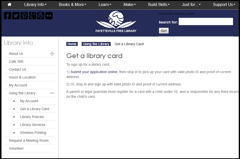
Fayetteville Free Library Get a Library Card Page
This Alameda County Library’s confusing library card page made me curious about how the Fayetteville Free Library might present the same information. In our week 3 assignment I found the FFLIB site was pretty good and had real attention to design, so I decided to compare the FFL library card page.
This was a very interesting comparison. The Fayetteville Free Library did a fantastic job of cutting words on this page. They have lots of space. They use second person language and text is brief so that information is easy to grab. But I found some flaws here.
First of all, they have cut so many words that some questions are not answered: am I eligible to apply for a library card? Do I need to be a resident of Fayetteville? Of Onondoga County? Of New York? I searched around for quite awhile to try and find this information and was unable to do so, even on other pages in the site or on the Onondoga County Public Library system site. My next question is, what counts as “valid photo ID and proof of address”? That information I was able to locate on the OCPL page about getting a card.
At the very least there should be a link on this page to eligibility requirements, but since the page is already so succinct I think adding it right on the page would not overburden the page with information.
Another small flaw on this page is the numbered list. Items 1 and 2 are not steps, but two alternatives for applying for a library card. Since there are only two items it is not that confusing but ideally it should be a bulleted list rather than a numbered one (especially if more information is added to the page).
My rewrite changes the numbered list to a bulleted one, and adds information I think the page should have. Information about types of ID was available on the OCPL site, but I had to make up the information about eligibility since I couldn’t find any. I presumed a policy similar to the Alameda County Library system policy.

Rewrite of Fayetteville Free Library Get a Library Card Page

February 27th, 2015 at 1:14 pm
I might be wrong but it looks like the Alameda Libray is using an old LibGuide structure for the entire web presence. While in theory I love libguides, they are a formatting and typography nightmare.
March 6th, 2015 at 5:12 pm
Yes, it is a LibGuides tangle. Not pretty!