New York Public Library Classes Page
I thought that the New York Public Library’s Classes page deals with the issue of library programs in a very large library system really well.
The overall site design and global navigation is well done. There is a lot of space, scannable text, and sensible persistent navigation. A brief line of text at the top of the page makes the important point: there are a lot of library classes and they are free! The essential message is presented and people can look for more detail further down, following the inverted pyramid style (Redish, 2007, p. 102-106).
This page uses a table and a filtering form well to deal with a very large amount of content. It’s logical to group all the classes together, but there are 1,934 of them (at press time)! How can anyone handle that amount of data? Well, they can handle it if the path is smooth (Redish, 2007, p.63).
The classes pages opens with the classes displayed in a nice table below the fold. Probably very few people want to scroll through all the classes NYPL offers but they no doubt come in looking to narrow it down in varying ways. The filtering form is a great tool for doing this–people can look for classes in their local branch, or classes on a specific day, or all classes for seniors (or by keyword also). Once people have narrowed things down by the criteria that are most important to them, they can scroll their results.
The table displaying the results is well done. It uses shading, light lines and sufficient space to make the text easy to scan without drawing attention to the table itself (Redish, 2007, pp. 231-232). A really nice touch is that the “context-giving column headings” (Redish, 2007, p. 231) are implemented to float and remain visible at the top of the screen as the user scrolls the content of the table.I found this page to be a highly effective presentation of a potentially overwhelming amount of information.
North Carolina State University Print Copy Scan Page
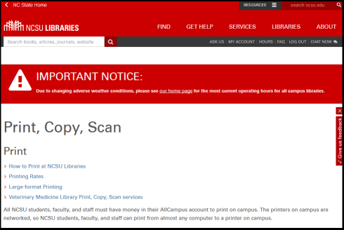
The North Carolina State University Libraries Print, Copy, Scan page is a good example of a page where information is layered to make a large amount of information into a manageable amount (Redish, 2007, p. 114).
As with the NYPL, the site design and global navigation is clean and scannable. On this page, Note the emergency notice (on the page at screen capture time though not when I first looked at the page and chose it!) giving users important information about alterations in the library schedule due to the sever weather conditions. This type of emergency banner is very useful for pages that users may bookmark or arrive at via a Google search. The banner prevents users becoming frustrated because they did not get notice about an unexpected schedule change.
Printing, copying and scanning is logically grouped together, but these topics (especially for a large library system) cover more information than can realistically be presented on one page and keep the page easy to read. Basic information about each function is presented, and clearly formatted links lead to pages with additional information. A clear path is presented depending on what type of information the user is seeking (Redish, 2007, p. 63). Sentences are clear and the second person (“your AllCampus account” and “You can purchase a WolfCopy card”) is used (Redish, 2007, p. 181). Although some weak verbs and passive voice are used, it seems appropriate: “Flatbed scanners can be borrowed” and “Zeutchschel Book Scanners are located” seem like a more appropriate way to write those sentences, since the interest is in what the library has. Numerous sentences saying “You can borrow A, You can borrow B” would be more difficult to scan.
This is a page for very functional information: “happy talk” is eliminated and users can quickly find the basic information they need or find the pathway to it.
REFERENCE
Redish, J. (2007) Letting Go of the Words: Writing Web Content That Works. San Francisco: Elsevier.


February 26th, 2015 at 11:22 am
Hi, Molly,
I had to laugh because I chose the NCSU web site as one of my well done web site choices. It’s fun to see people sharing the similar impressions of web sites. One of the things I really like about this course is getting a chance to look at a lot of sites I wouldn’t have noticed otherwise. Nice job!
March 6th, 2015 at 6:30 pm
Thanks! 🙂