I went to the Castro Valley Library to find my signs. I found two to work with, an informational one advertising the library’s online Mango Languages resource, and another sign that was a combination of directional and informational, announcing the location of the free tax help service in the library.
Mango Languages Sign

This sign advertises the Mango Languages online language learning tool that is available to library members. The orange and green color scheme has a pleasant, sunny effect, and makes sense with the service name, Mango. The Mango logo is pretty. However, there are a lot of problems.
The overall effect is very confusing. The most attention grabbing part is the huge “LOOK” and the arrow–neither of which tell you what the sign is about. The arrow points down to the end of the tagline. The next focal point is “FREE WITH YOUR ALAMEDA LIBRARY CARD.” But what is free? You have to read all the way down the sign before you can figure out what service the sign is advertising (Mango is a cool name but is not obviously connected with language learning). At the bottom of the sign it finally gets to the point: “Mango is an online, fast and easy way to learn to speak a new language. Get started now!”
Sounds great! Get started how?
The purple and gold Alameda County library logo doesn’t match with the orange and green Mango branding all that well. It’s understandable they want the library branding on there too, but it really adds clutter. I imagine this is a common problem when libraries have branded services (Mango, Overdrive, Zinio, etc.) but they also want to include library branding so people realize it is a library service and not an advertisement.
There is use of ALL CAPS to try to provide emphasis. The alignment is a mix of centered and left-justified which causes your eye to jump around a lot. The huge arrow makes your eyes jump around even more and yet it doesn’t point to a important feature or piece of information, so it isn’t helpful. This sign makes you work too hard to figure out what the sign is about.
The information on the sign needs to be cut down. It is on the front of a plastic box containing flyers with detailed information (a numbered procedure) on how to access Mango, so a lot of detail could be saved for the instructional flyer (which could stand to be rewritten too, but that’s for another day!)
I decided the most important information for the sign was that the library has an online language learning tool for members, and I tried to create a sign that conveyed that more quickly and clearly. I found some other Mango collateral on the web and found the image of the woman “picking up” a language and decided to use that.

I think this sign is more clear about the two main questions a viewer would have: What is this about and how can I use it? The graphic reinforces the fact that this is a language tool (unlike the arrow, which was just….a big arrow). I removed the library branding to reduce clutter–I think most people remember which library they’re in.
Principles
- There is a focal point and it answers the question of what this is about (Williams, 2004, p. 100)
- The image of the woman breaks out of the poster frame to open up the space (Williams, 2004, p. 18)
- Detailed information is shrunk down to small type to open up space (Williams, 2004, p. 27)
- Everything is left-aligned rather than centered/mixed alignment (Williams, 2004, p.48)
- Bold end and beginning (Williams, 2004, p. 50)
- Contrast provided with font size (Williams, 2004, p.144)
- Contrast provided with different font types, Oldstyle and Sans serif (Williams, 2004, p.131)
I also wanted to add a nice orange color gradient that matched the Mango logo (light orange fading to white at the bottom). This turned out to be a big hassle because the woman’s blouse is white and so making the area around her transparent without turning her blouse orange in patchy spots was very difficult. I gave this up.
Tax Help Sign
The second sign I chose was mainly directional but also had an informational aspect to it. The library has volunteers offering tax help by appointment. This sign just inside the front door indicates where you should go if you have an appointment.
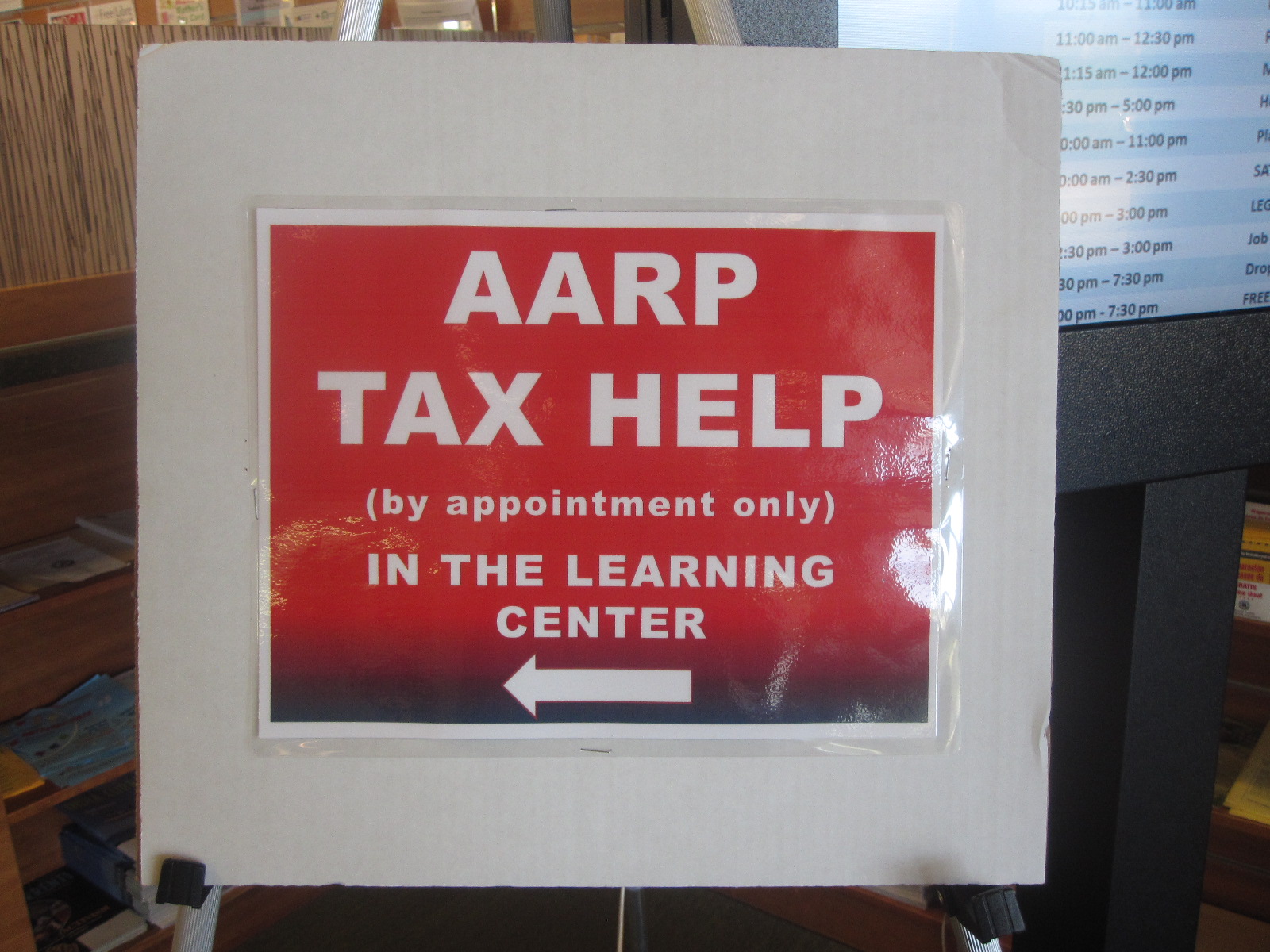
Once again, the dreaded center alignment and ALL CAPS. Also the “by appointment only” seems a bit stern, I wondered if there was a way to convey the same information with a more positive tone.
Williams mentions that warm colors like red “command our attention” (Williams, 2004, p.164). You certainly aren’t likely to miss this blood red sign fading to black. It was the first thing I noticed as I came into the library. I found this red offputting, and when I showed the sign to my husband he said, “It reminds me of blood, to be honest, and blood and taxes aren’t really things you want to associate.”
Also, unless I already have a tax appointment and know what this service is, I am likely to misinterpret this sign. I asked my husband what he thought this sign was for and he said “tax help for seniors.” That’s what I thought too. Actually “AARP tax help” refers to volunteer Tax-Aides from AARP. The service is available to anyone of any age who wishes to use it. In this case, the sign has too little information, since it is so vivid it will catch most people’s attention as they come in, but only those already in the know will understand it. I tried to make adjustments so that it served the primary directional purpose but also provided sufficient information to people whose interest was piqued by the idea of tax help.
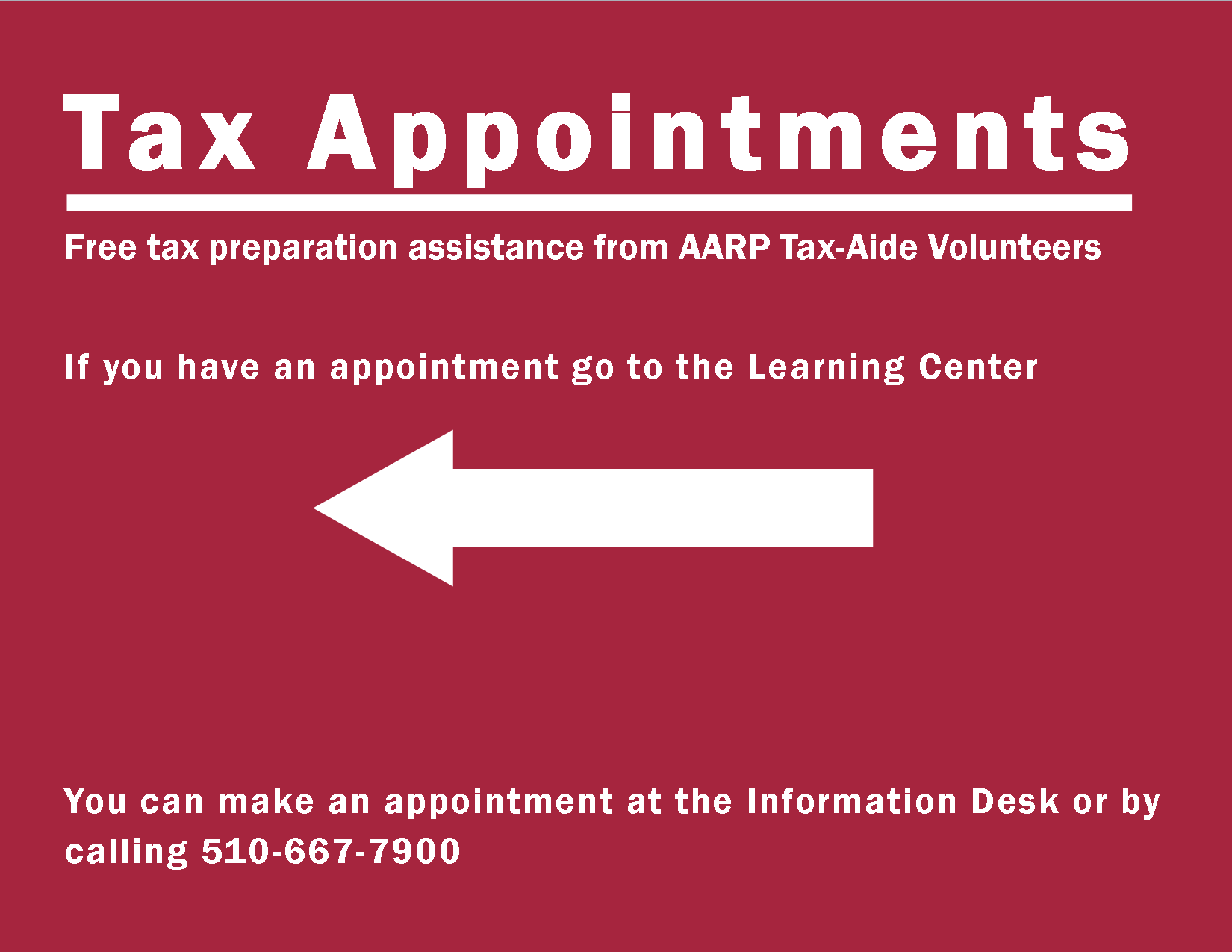
- All caps changed to sentence case and main heading made as large as possible (Williams, 2004, p. 157)
- Eye-watering red toned down to burgundy (Williams, 2004, p.164)
- Contrast provided by burgundy and white (Williams, 2004, p.63)
- Left-alignment (Williams, 2004, p.48)
- “Tax Appointments” heading conveys the idea that appointments are needed and will catch the attention of those with appointments needing directions
- Explanation of heading in close proximity (Williams, 2004, p.15)
- People who are interested in learning more about tax help or making an appointment know where to go to find out more
Reference
Williams, R. (2004). The non-designers design book. Berkeley, CA: Peachpit Press.

April 3rd, 2015 at 9:50 am
I think the overall redesign of your first sign is spot on. I think the choice of font could be better, but the spacing and alignment makes this sign much more clear and easy to read. If you were to quickly look at the original, you’d have no idea what it was for. Your new sign could be read from across the room, and the choice of graphic & lettering helps people interpret the sign even if they are too far away to read the text. Great job!
April 3rd, 2015 at 7:06 pm
Thanks for your feedback!
I changed the font about 20 times or so, I was never completely happy with it but at a certain point you have to just go with something. You’d think that with the gazillion fonts that come pre-loaded these days there would be some decent ones but I really couldn’t find a sans serif that made me completely happy. The original sign did have a font that meshed quite well with the Mango logo, a very elongated sans serif. Oh well! (Clearly, Mango has professional graphic designers even if the library doesn’t).
🙂
April 5th, 2015 at 3:52 am
Love your first redesign. I think including a person in the sign grabs your attention. There must be something in us that makes us stop and look at people more than we would just at words.
I wonder what the second one would look like with the human element added?
I too had an awful time with fonts. I finally “settled” on something – not entirely happy with any of the fonts I used. I will go back and play around some more before printing my signs and posting them. There are a couple of design elements I liked from signs classmates made that I would like to incorporate into my signs.
April 6th, 2015 at 6:31 pm
I think a good picture/graphic that helps grab attention and hold it does a lot for a sign. The trick (as we saw in the Williams book) is that you can’t just start randomly throwing images or fancy fonts in and hope it has an effect–the choice of image or font needs to support the meaning of the sign. If it doesn’t, it is better to keep it simple than to just keep throwing fancy stuff against the wall to see what sticks–so to speak.
Thanks! 🙂
April 5th, 2015 at 5:07 pm
Molly,
I love both redesigns. I like the feel of the revised version of the first sign; it is much more sophisticated. I also agreed with your husband’s interpretation of the AARP sign. Your version was much clearer.
April 6th, 2015 at 6:37 pm
Thank you! That tax sign is a good example of how obvious meaning is when you already know what it is. The people who made that sign know what “AARP Tax Help” is, so it never occurred to them the meaning was not clear to anyone.
Thanks again!
April 6th, 2015 at 1:20 pm
Hi Molly,
I love your redesigns. The Mango redesign looks terrific. It is easier to read and it makes it much clearer for patrons. I love the picture of the woman holding the language symbol. I like how you aligned the text and the font helps make the sign stand out. Great job!
April 6th, 2015 at 6:38 pm
Thank you so much! I really had a lot of fun with the Mango sign. 🙂 I appreciate your feedback.
April 18th, 2015 at 11:12 am
Excellent redesigns- especially the Mango Languages one. It’s a wonder more databases don’t offer customizable sign templates in order to prevent the crazy mishmashes that libraries tend to come up with! If Mango could see that original sign, they’d probably happily volunteer their services!
Yours, of course, is better than any generic template could be and would definitely catch a patron’s eye.
April 27th, 2015 at 7:02 pm
Thank you! 🙂
The thing is, from looking online I could see from other libraries that Mango clearly DOES have marketing collateral that could be used! (Of course maybe it’s not free). I’m not sure why the Alameda Country library chose the cluttered home-grown sign instead; “mishmash” as you say!
There were several other signs in the library very similar to the Mango sign, advertising other library services (like Zinio) so it may be the library thought the Mango sign should harmonize…..with all the other terrible signs.