I used this assignment as an impetus to go a couple of new places around here that I have been meaning to try, but hadn’t gotten around to. I wanted to approach things with fresh eyes so it seemed important to go places I haven’t been.
Hayward Book Shop

Hayward Book Shop Exterior
My first safari was to the Hayward Book Shop, an independent bookstore that sells both new and used books. My 4th grader wanted a book or two about Frida Kahlo for the women’s history month essay his school does. My 6th grader is doing a “genre challenge” at school where they read books from 7 different genres (while we have “fantasy fiction” well covered here, we were underrepresented in categories like realistic fiction and science fiction–at least, books in those genres for a sensitive 11 year old to read). They have sustained silent reading sessions at school and they have to have a book–ideally a nice light paperback since they make them carry so much other stuff it is ridiculous. I thought I could score some inexpensive books for both boys.
I did not take the children with me. I would probably have bought more books than I already did if I had. They are well aware that asking for books is mommy’s weak point.
What was the goal of this service and was it met?
My goal was to find some books for my kids–not specific books, but I had some genres in mind and hoped they would have a decent collection and I would be able to browse and find something.
My goals were definitely met. I came out with a large stack of books for the kids. Yay!
Was this experience overall positive or negative?
The overall experience was very positive (I mean, it’s a BOOKSTORE!!) They could throw the books at me after I paid for them and I’d probably still think it was positive. (Note: They didn’t do that.) There was a good selection of books, it was fun just looking around, and I left with a good haul at a price that pleased me since most of them were used, and yet in very good condition. (Slightly negative aspect: my husband saying “Did you just go and buy MORE books?”)
What was good about the service?
The new book selection was modest but good (caved and got the new Neil Gaiman book for myself!). The used book selection was quite extensive and I was quite pleased at being able to find several things I felt the kids would like.
What detracted from the experience?
The only real drawback was the website (too wordy, too busy) and my attempts to get information on how to get to the store. It wasn’t REALLY difficult but it was a little bit hard to find the location/directions. Although I know Hayward, they recently redid the downtown area and changed the one way streets to create better traffic flow (in theory), so I was a little anxious about how to get there and where to park. The website “Location & Directions” link just takes you directly to Google maps. I prefer it when there are some general directions with Google maps or Mapquest embedded so that you can get more information if you needed it. My problem wasn’t that I did not know where the bookstore was (I knew the street and recognized the address), what I would have liked to have seen was a few lines about “you can park in the nearby free civic parking lot” or something like that, and perhaps something about the best way to access the one way street the bookstore is on.
Another aspect that might be a drawback to some people is that the bookstore is very much like other used bookstores. It’s not like Barnes and Noble with huge signs everywhere, plenty of open space (the real life equivalent of white space), and so on. The books are jammed in floor to ceiling, signs are small, and beyond the separation of new books at the front of the store and the used books as you go further in, the store navigation is not obvious. For people who love used bookstores, the serendipity and the sense of exploring and the smell of old books is all part of the fun, so I didn’t mind this, but to non-book fanatics it could detract. I certainly wouldn’t want to go in to a hardware store that was organized this way. I think it works for the nature of this business (books are neat) but would be quite annoying in a hardware store when I wanted to find a very specific washer to fix my sink.
Basically, it is an excellent bookstore for browsing, but if you were in need of a specific book and really wanted to have it TODAY, a large bookstore like Barnes and Noble might be preferable. This is the kind of bookstore, however, where the thrill of exploration and discovery is part of the experience, not just the simple acquisition of a book.
With whom did you interact?
There were a lot of bookstore employees. Sometimes I wonder if stores like this can really afford all the employees they seem to have–I’m guessing the appeal of working in a bookstore is a big attraction for book fanatics. It was a slow weekday afternoon and the store was almost empty of customers but I spotted five different staff members. Four out of the five spoke to me, one I only glimpsed from a distance. Two staff members who were stocking a new display said hello, smiled and said excuse me as they moved past me with stacks of books. A few minutes later a third employee noticed me browsing and asked if I was looking for anything in particular. I volunteered the information that I was looking for books for my middle schooler’s genre challenge, she gave me a quick tour of both the new and used children’s sections, specifically indicating where the chapter books were. She then said to find her and ask if I had any more questions. About 15 or 20 minutes after that, a fourth employee came along and noticed the (now large) stack of books I was carrying and said “would you like your arm back?” She offered to take the books up to the counter for me and we talked about books for a little while. Everyone I spoke to was friendly and helpful, but without a sense of trying to rush me.
Were you confused at any time during the experience?
The only time I was confused was when I was figuring out how to get there, and while driving there. This turned out not to be as bad as I anticipated, but since traffic and parking can be fraught in the Bay Area, and friends have complained (a lot) about the downtown Hayward rerouting, I was a little anxious and confused. The fact that we live in a busy exurb area is not something the bookstore can help, of course, but a little more website info might have been helpful. I almost always check websites for traffic and parking information before going places since around here that is usually the worst aspect about any expedition.
Describe the physical space.
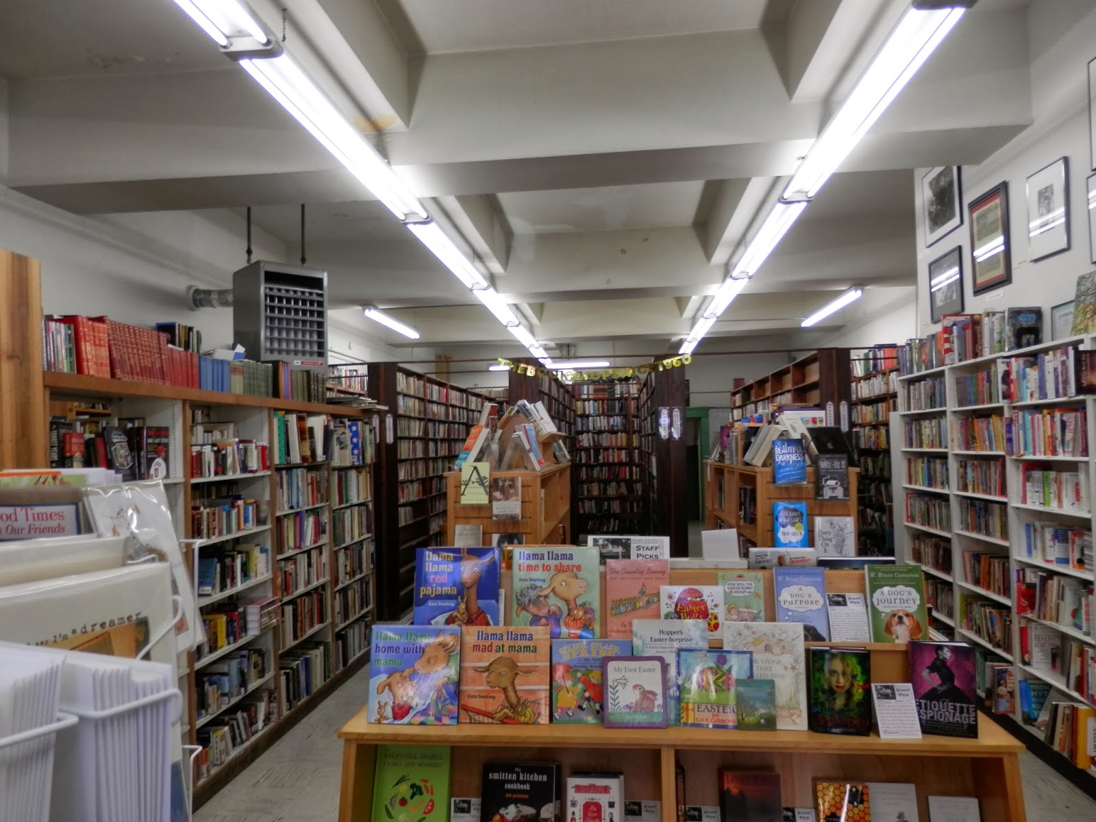
Inside Hayward Book Shop
The bookstore is located in a downtown area that is TRYING to revitalize. There is a mix of old and new on the street. The book shop has been there a long time and it is a little shabby. I noticed as I walked up that the front door was propped open and on the inside of the door (which was facing the street since the door was propped open) there was a large sign saying “YES WE ARE OPEN! PLEASE COME IN.” This is particularly helpful since there are a number of closed businesses on the street, hit by the downturn. Making it abundantly clear that this particular shop is open for business was good UX.
Inside it was a pretty classic used bookstore–a little cramped, a little dusty. Books up to the ceiling, one tucked away room with more books in it that you discover as you go back. I find this very appealing, as most book loving people would. There were chairs and stools scattered throughout as space allowed, clearly affording the ability to sit and peruse a book more thoroughly, adding to the “browsability” of the space.
At the back of the store I noticed a stock area where the bathroom was–there was a sign on the bathroom door that said “Not a Public Restroom — Please Ask!” I didn’t need the restroom but I am guessing it was locked but perhaps that they would unlock it for you if you were desperate. Downtown businesses (sadly) often need to discourage people from coming in and using employee restrooms. One often sees signs that say “No Public Restroom” or “Restrooms for Employees Only.” I thought this sign was interesting in that it sort of hints at a softened attitude about that–as in, if you really need it, okay, but please ask.
Describe the customer service.
Very friendly, not rushed, helpful. This is appropriate to the venue since it is a “browsing” type of business. I was greeted by almost everyone working there, and helped by two different people on three separate occasions–finding the children’s area, taking my books up to the counter, and checking out. Everyone seemed happy to be there and was friendly and helpful. I was helped to find things and a couple of people indicated to me that they were approachable at any time if I needed more help. The employees engaged in tasks (like stocking or answering the phone) still acted in a friendly and approachable manner, rather than making me feel that I was interrupting them.
The Doolittle
My second safari was to The Doolittle, a bar that has recently opened up in Castro Valley. There aren’t many nice bars in Castro Valley (actually pretty sure this is the only one). I was excited that there might be a bar I’d feel comfortable going to have a drink with a friend. The Doolittle has a lot of craft beers on tap and good cocktails (so I heard) so I had been wanting to try it out.
What was the goal of this service and was it met?
The goal was to have a drink in a pleasant atmosphere. Yes, I met the goal, and I would go back there.
Was this experience overall positive or negative?
Positive. (Seriously, this was the best assignment ever. Bookstores and cocktails.)
What was good about the service?
The bartender was friendly and helpful. There were a lot of choices–a long list (about 30) of bottled beers, 12 taps, and a sizable cocktail menu. The drink I ordered (Lemon Drop) was delicious. The atmosphere of the bar was relaxed and fun, and although I felt shy at first, I ended up talking to a couple of other patrons and it was a very friendly community atmosphere.
What detracted from the experience?
I was a little hesitant when I drove up and saw the door, which was one of those solid steel doors like a hole-in-the-wall dive bar might have. The outside of the building was unprepossessing, in a mini strip mall with a large construction site right next to it. The approach to the bar wasn’t all that attractive. They do have a pretty painted sign–the only way one would know from the outside that something nice might be inside.
With whom did you interact?
I talked to the bartender and chatted with two other patrons who were also sitting at the bar. It reminded me of being in Ireland and how pubs are community center-ish in nature.
Were you confused at any time during the experience?
Just a teensy bit when I walked in, I wasn’t sure if I wanted to try the craft beers (which looked great) or a cocktail (since I’d also heard their cocktails were awesome). Yes. First world problems.
Describe the physical space.
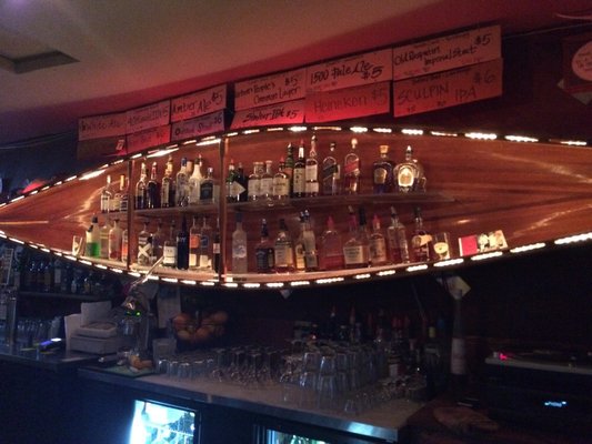
The Doolittle (canoe shelf with taps listed above)
The outside, as I mentioned above, wasn’t that attractive. It’s in a strip mall next to construction, the paint on the strip mall is faded and there is a liquor store with a very old fashioned, cheesy looking sign. The inside I found very attractive in a shabby chic way. Lots of wood, wooden booths and tables, and a pretty old wooden bar. There was a canoe on the wall above the bar and the bar also has a record player and a large collection of vinyl records that they played (propping up the current record so you can see what’s being played–it was Led Zeppelin while I was in there. There are several televisions with sports but they were on mute. It wasn’t very loud, for a bar.
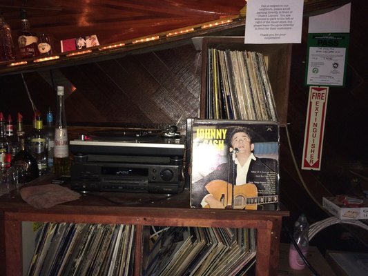
They have actual records!
Describe the customer service.
The bartender (the only employee present) was very friendly. She helped me make up my mind between beer or cocktail and I chose a cocktail. She mixed it up for me. Later I started chatting with another patron and she joined in (and we found we both have 6th graders). I noticed when another patron paid her and left she said “Nice to meet you, enjoy your stay in California,” which indicates that she talks to people and is friendly. When I asked her about one of the tap beers that was listed she told me a little about it and offered me a sample, which was a very nice touch. I heard her discussing beers with yet another patron. She was very friendly and knowledgeable, and she helped establish that “community” feel the bar has.
This assignment was really fun. I get so busy and tend to run only necessary, rushed errands–grocery store, carpool, vet. I did not really think about this consciously but upon reflection I realize I chose safaris that were of a very different nature than a “get something done” errand. Both a bookstore and a bar are places to savor the experience; this made me reflect on how “good” UX caters to what users most likely desire. A used bookstore is not a place to “get a book,” it is a place to browse for books and enjoy the experience of doing so, plus maybe buy books. And bar isn’t just a place to have a drink, since I could go to a grocery store and buy stuff to drink, it is a place to perhaps savor unusual taps or drink recipes, talk about them/learn about them, and to talk to other people as well. These service safaris were a good way to think in terms of the experience and not just the obvious product.